Transition Towards a Sustainable Strathclyde
Expanding PV
Aim
The aim of this report is to consider the expansion of the University of Strathclyde’s photovoltaic network and examine if doing so would be a beneficial strategy in helping the university to become a more carbon neutral campus. This was judged on emission reduction, demand coverage, financial performance, and timeframe of implementation.
In the last five years, many universities across the UK have begun to expand and implement solar arrays in their effort to reduce carbon emissions and save money on their electricity bills. Some projects include The University of Exeter, who claim to have reduced their emissions by 100 tonnes with a project completed in 2020 (Exceter, 2020) and in the same year Edinburgh University also invested in PV arrays that they estimate could save them £200,000 in their electricity bill (Edinburgh, 2020). These are only two examples of many universities that, due to fast approaching carbon-neutral goals, are investing in renewable energy projects. This does not only to reduce energy bills and carbon emissions, but also demonstrates to the public that the university is active in the fight against climate change.
When looking at potential on-campus strategies to help in the pursuit of the university’s targets, it was found that the expansion of the PV network may provide a short-term approach that could be quickly implemented. Expanding the renewable energy supply has the potential to reduce carbon emissions, generate revenue, and improve the universities environmental reputation, all in a relatively short amount of time. Having already installed PV on the campus, it was deemed that expanding the current system would be a beneficial option for the university to consider.
Strathclyde Campus
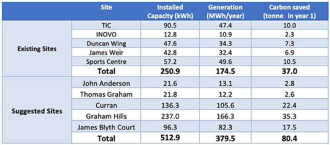
In 2018 Strathclyde university made the decision to integrate renewable energy into the campus electricity supply in the form of photovoltaic (PV) array installations. This partnered the implementation of the new combined heat and power (CHP) system in helping the university meet the carbon emission targets for 2020 and beyond. The arrays were installed on two buildings, the Technology and Innovation Centre (TIC) and the ‘INOVO’ building with installed capacities of 90 kW and 12.5 kW respectively. Following the successful integration of these arrays, the university looked to expand the supply with the German energy company ‘E-on’ submitting a proposal on potential sites for new arrays. The proposal was submitted to the university in 2019 and included the potential expansion to a further five sites, four of which were situated on top of campus buildings and the fifth, an outdoor space of the campus.
Of the suggested sites, only two are in operation today, located on the Duncan Wing and James Weir buildings. Alongside the TIC and INOVO arrays, this makes up the four currently operational arrays within the John Anderson Campus. In addition, one more array is installed on the Strathclyde Sport building however it is yet to be connected to the system and contribute to the electricity supply of the campus. Table 1 provides detail on the installed arrays on the campus with the available specifications.
Table 1: Current PV Network Information
Methodology
The following section will provide a brief description of the steps taken in completing the technical work behind this strategy.
Literature Review and Data Analysis
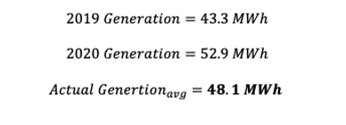
Raw data on generation was made available by the university for analysis. This data was provided in the form of daily values of generation (kWh) over the course of two years (2019/2020) for the TIC array. With this data, the generation over a whole year could be calculated and an average value found. Alongside this data, there was also access to the daily electricity consumption of a range of buildings for several years. Once again, average values for monthly consumption were calculated. Finally, technical information was made available on certain aspects of the existing arrays. This included the type of panel being used on the TIC building. For the INOVO building, specifications included panel tilt, azimuth and the type of inverters used. This information was used later in setting the parameters of simulations. Further to this, a literature review was carried out to gain an understanding of standard values associated with PV projects to create ballpark areas that would provide confidence in results. (Boxwell, 2019)
Choice of sites
The first buildings chosen to be simulated were those that already feature existing arrays. This allowed calibration and comparisons with real-life data to be made, as well as estimates of the total installed capacity of each array. Following this, the sites that had been suggested in the 2019 ‘E-on’ report were simulated, to add reliability to the results by comparing projects. Finally, Thomas Graham and John Anderson were simulated. Thomas Graham is the main subject of the case study for the retrofit section of the project and John Anderson is one of the buildings on campus that has a high energy use intensity that had not yet been considered for PV installation, making them both buildings of interest for our project.
Simulations
The analysis and modelling of the PV arrays was performed using two online tools. Both tools were chosen for their user-friendly nature and are briefly discussed below.
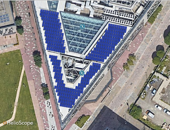
The primary tool used was Helioscope which is a free online software that utilises google maps and weather data sets to model PV arrays. Satellite imagery of the selected site is used to mark the areas in which the solar panels will be installed. These areas are referred to as field segments. The software requires the selection of the panels that will be installed along with module spacing, solar azimuth, tilt, and electrical specifications to complete the design of the array and allow the simulation to be run. From the simulation, a report was generated on the performance of the design over the course of a year in relation to the selected data set. For the simulations carried out in this project the weather data set used was that of Oban, a small town 158 km to the Northwest of Glasgow. This simulation tool uses the inputs to predict the capacity of the installed array and provides monthly data on generation. Another output of the simulation which was particularly useful in relation to the data that the group had access to, was a monthly generation profile. This allowed for a direct comparison between the generation and the current consumption.
The secondary simulation tool used to add reliability to the results was PV Watts. PV Watts is a tool provided by the National Renewable Energy Lab (United States). It is an online software that utilises satellite imagery. However, in comparison with Helioscope, the inputs to the software are far fewer, meaning there is less control over the characteristics of the simulation. This tool is more of a rough calculator for the potential of a site and would provide quick results for analysis and comparison to raw data.
The first simulation that was run covered the TIC building array. From this, the inputs into the model could be calibrated to produce results that reflected the real-life data as closely as possible. These inputs were then made the standard for the other simulations. With the calibrated model inputs, the remaining existing PV arrays were modelled to obtain an understanding of the existing networks’ contribution to the university’s total electricity consumption. Following this, the suggested sites for expansion were simulated in the same way to obtain the strategies results. Figure 1 shows Helioscope in use. Full simulation reports with technical inputs and results will be available in downloadable content on the website.
Figure 1: Helioscope simulation software in use
Results Analysis
Post-processing of modelled data was carried out using Microsoft Excel. Averages of the results from the two simulation tools were found and a correction factor based on the error was used to yield more realistic results. The corrected results from the simulation, along with the simulation results for the ‘E-on’ proposal, allowed yearly generation for each building to be calculated. This allowed carbon savings to be found, and financial analysis carried out.
Calculations & Results
The following section will give detail on the calculations carried out in analysing the simulation data and generating key results. The discussion of the results will be provided in section 6 of this report.
The first step in the calculations was to calculate an average yearly generation for the TIC building from the data that was made available. All sample calculations shown are based on the data from the TIC building. This can be seen below:
This allowed an error percentage to be found between the simulation results and the real-life generation data for the TIC building. This was achieved by first taking an average of the two simulation results and then carrying out a simple error calculation. This can be seen below.
The percentage error calculated was relatively low which suggests that the simulation results are reliable and hence the model can provide a realistic approximation for generation.
An average of the simulation results was taken for each building and the error percentage was then applied in the most conservative way to give the final generation results for each site.
The same method as seen above was used for each site. Following this, the installed average installed capacity for each site was calculated using the same method of taking an average from the Helioscope simulation data and the ‘E-on’ proposed site capacities for the applicable sites. This allowed the specific yield (kWh/kWp) to be calculated for each site, a useful parameter when looking at solar panel performance.
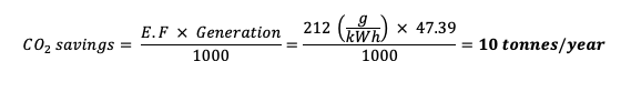
With the generation values calculated, the carbon emission savings could be deduced. This was done using the electricity carbon emission factors (E.F). These emission factors are subject to change year upon year. (Department for Business, 2021)
Table 2 summarises the key results of the simulations and calculations for all suggested sites on the campus.
Table 2: Key Initial Results
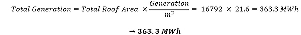
Next, for each site, the calculated data was put into a more general context by calculating the generation per square meter of roof. The total roof area for each building was calculated using the measuring tool in Helioscope. The total roof area was used because it reflects equipment and structures that do not allow for solar panels to be placed, giving a more realistic prediction for generation on different roofs.
The calculation was carried out for every site and led to an average value of 21.6 kWh/m2, thus higher than reached for TIC. This allowed a further prediction to be made. For the analysis, it was assumed that the remaining nine buildings connected to the university’s district heating network (DHN) would have PV arrays installed on their roofs. Once again, using Helioscope, the total roof areas were measured and summed, and the average generation per m2 per year was applied to give an approximation of the potential generation if the PV network was expanded even further.
The potential CO2 savings were then calculated as before, giving theoretical savings of 77 tonnes in year 1. With the combination of both the simulated scenario and the theoretical scenario, the total CO2 savings are equal to 157 tonnes.
When calculating the contribution of the new PV arrays to the university’s demand, a baseline value of electricity purchased from the grid of 15 GWh_e was used. A simple calculation, seen below, was carried out to calculate the PV arrays’ contribution.
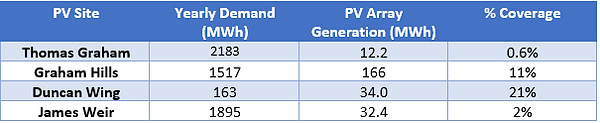
The same method was used when calculating individual array sites coverage of the building they were situated on. This was only achievable for the buildings where data was available for demand and simulation data had been acquired. Table 3 shows these results.
Table 3: Demand & Generation Data
Financial Assessment
This section will outline how the financial assessment was carried out for the PV strategy. The discussion of these results will be available in section 6 of this report. All sample calculations will be carried out using data from the John Anderson array.
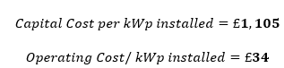
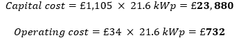
The results are based on capital and operating costs quoted by the university for the Duncan Wing and James Weir arrays. Alongside this, the ‘E-on’ proposal had the same information based on their outlined projects. This data was used to predict a capital and operating cost per kWp installed and then applied to the sites suggested by this project. Below the average values for the two aspects are provided.
The following calculation shows how the capital and operating costs were calculated for a suggested array.
A price of 20p per kWh_e was quoted by the university and was the price of electricity used for the year 2022. This allowed the savings due to offsetting purchases from the grid to be calculated for each suggested site. The sample calculation below will show how the savings were calculated.
Table 4 summarises the results for each suggested array.
Table 4: Financial Results of Suggested Sites
An assumption was made that the university would fund this project, eliminating the need to loan money and pay interest on the capital cost. Another assumption that was taken was an average value of the operating costs. This was based on 3% inflation over the 25-year lifespan of the project. The following formula was used to calculate the average operating costs (André Müller; Felix Walter (1992)).
Where:
m = a value based on 3% inflation over 25 years
One final assumption that was made was an increasing electricity price of 6% year upon year. The above assumptions allowed a financial forecast to be produced for the lifespan of the PV arrays. This resulted in a payback period between years 8 and 9, and a final revenue of £3 million at the end of the 25-year lifetime of the project. The calculation below shows how the cash flow was calculated year upon year. For the full table of the financial forecast see Appendix B.
Table 5 summarises the key findings from the financial assessment.
Table 5: Key Financial Findings
Figure 2 shows the developing cash flow throughout the project's lifetime.
Figure 2: Revenue Over Project Lifetime
Discussion
Demand & Generation
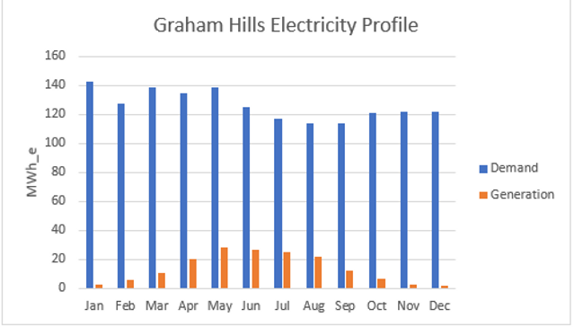
The data that was made available by the university was very helpful in carrying out the technical work on this section of the project. The generation data and specifications of equipment provided a solid foundation on which the work was based. Furthermore, the consumption data available allowed analysis to be carried out on whether the suggested PV sites would generate electricity that would be fully consumed internally or would need to be exported. This was an important factor to consider as if not consumed, there would be a cost associated with exporting and doing so would weaken the financial forecast and ultimately be detrimental to the feasibility of this scenario. The consumption data was only available in daily form, which proved to be adequate for the analysis. Helioscope provides results in monthly generation form. This allowed a direct comparison to be made between the simulated data and the consumption data for the buildings which had both sets of information. Figure 3 shows the monthly consumption and generation of Graham Hills.
Figure 3: Graham Hills Electricity Profile
From the figure above, the conclusion can be drawn that during the summer months, when the university is less active and there are more daylight hours, the electricity consumption is lower. When comparing to the simulation results, even in the months of highest PV production, there is no month where generation exceeds consumption. This is the case for all the buildings for which data was available for both consumption and generation. From the buildings where consumption data was available, the contribution varied. This is due to the size of the buildings and their different purposes causing higher or lower demand. On average, the PV arrays covered 9% of a building’s demand, however, this is likely to fluctuate heavily from case to case. The electricity of the other buildings can be seen in Appendix A.
Grid Coverage
A key part of the analysis was to look at the contribution of PV to the university’s electricity consumption as a whole. This was looked at in three scenarios. Case 1- Existing PV arrays, Case 2- Existing + Suggested PV arrays and Case 3- All DHN buildings with PV arrays. The baseline electricity consumption from the grid was taken to be 15 GWh / year. Using simple percentage calculation, the coverage in Case 1 was calculated to be only 1% of grid purchases. A caveat to this value is that the only real generation data available was that of the TIC building. The remaining yearly generation of the existing buildings was simulated based on the base model of the TIC building and applying the error of 12%. However, confidence in the results comes from the size of the existing arrays compared to the TIC array and the generation values being of a suitable scale when taking the array size into account.
Case 2 also relied on simulated data. With the summation of the existing arrays and the simulated arrays, the grid coverage increased to 4%. Once again, the same uncertainty that exists with case 1, applies in case 2. However, when looking at the installed capacity of both cases, a rise in coverage of 3% is a realistic outcome.
Case 3 is a more theoretical case. Simulations were not carried out and rather the remaining nine buildings in the DHN were simply added based on average values of generation per meter square of roof. It was found that accounting for the whole roof area and not just roof space would provide a more realistic approximation of how much power could be generated from building to building. This case has shortcomings when considering each building individually. Certain buildings may experience too much shading or have inadequate roof space to house solar panels. This said, with case 3 included, the total grid coverage rises further to 6%, an increase that is expected.
Even in the most ambitious of scenarios, this PV strategy does not offset grid purchases by large amounts. However, the university would save money, the capital cost is relatively low, and the project would reflect well on the ambition of the university to move towards a sustainable campus. In addition, installing PV has been shown to provide a positive cash flow in the long run.
Carbon Emissions
When calculating the potential carbon emissions saved by offsetting grid purchases, it was found that the PV arrays once again are not the answer to reducing emissions as a single entity. Carbon emission factors have declined over the last decade steeply and with the ever-increasing progression toward renewables, electricity will only become more carbon-friendly in years to come. However, CO2 emissions are reduced using this strategy, all be it small amounts relative to the university’s total carbon footprint. This reduction is important as once again it would show the university’s intent to support renewable energy projects on campus and not just offset carbon emissions with projects miles away from the campus itself. (Department for Business, 2021)
Financial
The main attraction to this strategy is in a financial sense. The payback period is short relative to other strategies, meaning that revenue can start to be generated in support of other projects. The infrastructure and knowledge on running such technology is already present at the university, so expanding this network would be a good opportunity to save on electricity bills as well as provide the advantages outlined previously. This relies upon the university funding the project itself, something that would be achievable considering the quick payback period and the funding available to the university in their pursuit of meeting their own targets and the city’s net-zero goals.
The caveats to the financial forecasting model are the heavy reliance on assumptions. Operating costs can fluctuate depending on equipment failures. This was the reason an average value of operating cost was applied over the lifetime of the whole project. The price of electricity was assumed to increase yearly with an inflation of 6%. This is an assumption, and it is unlikely that the price of electricity will follow a pattern and rather fluctuate depending on many unforeseeable external factors. It is also known that the university has contracts in place for the purchase of electricity for several years to come at a fixed price. The increasing electricity price was used to account for inflation in general and the cost of energy increasing at the present time.
Conclusion
The PV expansion strategy does not provide a full solution for the university meeting its carbon emission targets. However, the university invested in solar power in 2018 as it was seen as a worthwhile endeavour. Having already installed five arrays, the university is familiar with the technology and economics of such a project. With this strategy’s suggestion of expanding this network, there comes several advantages. Carbon emissions are reduced by a small amount and the electricity demand can be potentially covered by as much as 6%. Through the addition of six more PV arrays, the university could be seen to be making a great effort to move towards a sustainable campus, rather than offsetting emissions with projects that lie without the boundaries of the campus or even the city. The payback period is relatively short (8-9 years) and a capital investment of £500,000 could see a return of over 500% over the 25-year lifetime of the project. This revenue could be re-invested into other projects and strategies and go a long way in supporting the push towards a carbon-neutral campus. For these reasons, it is thought that this expansion of the network would be a worthwhile strategy should the university action it.
Future Work
Future work on this project could include further simulations on buildings throughout the campus, potentially using a more in-depth/sophisticated simulation tool that could produce more accurate results and daily generation data. Having studied and carried out this project on the John Anderson campus, the group noticed that there is a lot of room for improvement with the lighting controls around the campus since in many rooms, lighting seems to be on all the time. Further work could include looking at control systems to lower the electricity demand of the campus and thus increase the contribution of any solar arrays that may be installed.
References
-
Boxwell, M., 2019. solarelectricityhandbook.com, s.l.: Greenstream Publishing LTD Department for Business, E. &. I. S., 2021. www.gov.uk/government/publications/greenhouse-gas-report. Available at https://www.gov.uk/government/publications/greenhouse-gas-reporting-conversion-factors-2021 [Accessed March 2022].
-
Edinburgh, 2020. ed.ac.uk/sustainability/news/2020/solar-farm. Available at: https://www.ed.ac.uk/sustainability/news/2020/solar-farm [Accessed Febuary 2022].
-
Exceter, 2020. exeter.ac.uk. Available at: https://www.exeter.ac.uk/news/homepage/title_805958_en.html [Accessed Febuary 2022].
-
freeingenergy, 2020. freeingenergy.com. Available at: https://www.freeingenergy.com/math/solar-pv-gwh-per-mw-power-energy-mwh-m147/ [Accessed 2022].
-
PVeducation, 2022. Available at: https://www.pveducation.org/pvcdrom/properties-of-sunlight/measurement-of-solar-radiation Honsberg, C., n.d. pveducation.org. [Accessed 2022].